Sunday, November 23, 2014

Artgazer Spotlight: Rebecca Kinsinger Bowman

When we moved into our house, I had the distinct privilege (and challenge) of figuring out just where all of our artwork needed to go. The presentation of a work of art can affect it's reception just as much as the work itself (i.e. El Jaleo at the Isabella Stewart Gardner Museum), and I wanted our art to be seen and appreciated. This inclination felt particularly strong for me with our original works and limited edition prints. It occurred to me, however, that these works would still have a limited viewership among our family and friends. I am so proud of and excited by the works I have accumulated (though the collection may be small), I want to share them with you! So, I'd like to introduce a new series: The Artgazer Spotlight.

Artgazer Spotlight: Rebecca Kinsinger Bowman
This first artist holds a special place in my heart because of her closeness to my family. My mother’s college roommate and long-time family friend Rebecca Bowman works out of southern Ohio. She achieved a BFA from Miami University in Oxford, OH, and comes from a strong line of artistically-gifted Kinsingers (i.e. her brother Jay builds gorgeous wooden bikes!).  

Though she dabbles across the artistic spectrum (for example, her college “Rock-Paint” jewelry), she has been finding success with her animal-detail paintings; specifically, with her detailed animal Totem paintings. The totems combine her great love of wildlife with her affinity for Native American history.


For those not familiar with animal Totems in Native American lore, the totem is a series of animal guides that an individual may call upon throughout their life "to get in touch with specific qualities found within an animal which the person needs, connects with, or feels a deep affinity toward." (Source) Animal guides are to advise and protect you throughout your earthly and spiritual journey, and you may have many different guides throughout the course of your life. 

A different friend had inspired me to investigate what my own Totem would be and after an in-depth search, I realized the Horse (My base, my values), the Rabbit (My earthly self), and the Hummingbird (my spiritual self) as my animals. To be clear, you do not just choose whatever animals sound cool to you - You pay attention for animals you see frequently, you dream about, or you feel connected to. My cousin Jimmy identifies with the Mountain Lion; Lacey with the Raven and the Dragon. I am pretty convinced my brother is a Cardinal and a Wolf.

For my graduate school graduation, Mom had Miss Becky create my Totem for me. Oh, how I cried when I pulled them out of the bag. Each canvas (6in x 8 in) had a lovely note written on the back. Husband (who at the time was still Boyfriend), also got emotional because the image of the rabbit looked remarkably like his boyhood pet rabbit, Nibbles. That intuitiveness and attention to who the recipients were made the gift even more special. It was the most incredible gift that I will cherish forever.


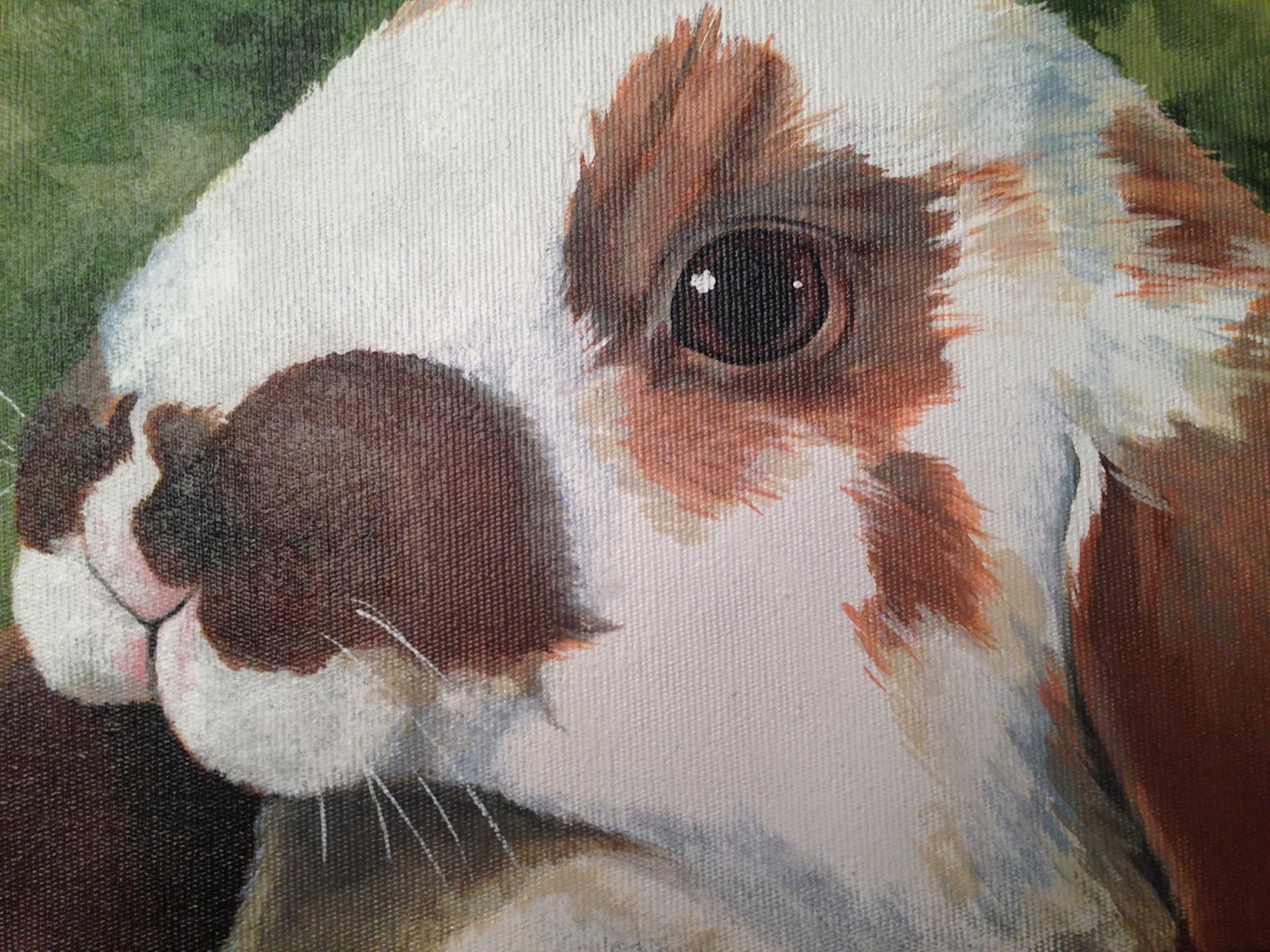
These Totem paintings are all typically on the 4 in x 5 in canvas. Miss Becky doesn't use that small space to force the entire animal form; rather, she selects a detailed, close-up shot to fill the composition. My hummingbird is an exception to this standard, as they are already so small. The detail within this small space is absolutely amazing (and my cruddy photographs do not do them any justice). I think the Hummingbird does a pretty good job of showing you the detail and attention Becky puts into her paintings.  


If you are looking for a unique, personal, special gift for a friend or loved one, I highly suggest you check Miss Becky out. I have seen pieces of owls, squirrels, sheep, various birds, tigers, dogs, pandas, lions, and lizards. You don't have to have your Totem figured all out - Even simply your favorite animal can turn into a wonderful painting keepsake you or the animal-lover in your life will love for a lifetime! 


www.kinsingerbowman.com 

Friday, November 21, 2014

12 under 20: Decoy 2012 Pinot Noir

WELL, I have catching up to do if I’m going to give you 6 more 12 under 20’s by December 31st!

So when we went to Napa back in July, along with Markham we also stopped at Duckhorn. WOW. We did a wine and cheese pairing with them and it was a delightful time (worth the money if you get the chance to go).


Unfortunately, most Duckhorn wines won’t quite make the “under $20” mark for this blog. However, Duckhorn is part of a great ducky family FULL of options that will fit whatever your budget while maintaining their high quality and brand acclaim. Sister vineyards include Decoy, Paraduxx, Migration, Goldeneye, and Canvasback.

12 under 20: Decoy 2012 Pinot Noir
Decoy was the first of Duckhorn’s sister vineyards that we explored (at the store). Husband’s birthday was last week and aside from Chianti’s and Cabs, the man appreciates a good medium-bodied Pinot Noir. We were pairing this wine with a baked, lemon-seasoned salmon, mashed potatoes, and green beans. Most often people would advise pairing a white wine with fish, but for red-drinkers like Husband, the Pinot Noir is an excellent compromise.

The back of the Decoy 2012 Pinot Noir label pretty much sums it up: “The everyday wine for the well-informed.” Consider this post you being informed!


This vintage is 100% Pinot Noir grape, aged in 100% French Oak Aged Burgundy barrels (Luscious!). It was fresh and full of bright, red fruit.  I personally experienced the mouthfeel of cranberries and raspberries and it had a soft, oaky zest to it. This wine was fruity and light enough for those that don’t prefer heavy red wines, but also toasty enough for wine drinkers that enjoy notes of wood and spice.

Their 2013 varietal is sounding more earthy and herbal (lavender, sage, mushroom, white pepper amidst the blue and red berries)…so for those that prefer the warmth and lushness of more fruit, try the 2012 first.

The Decoy Pinot Noir just barely skates under our $20 cap at $19.99 at Total Wine. That tends to be the average price for this wine, though the Internet says some lucky wine aficionados might be able to find the 2012 as low as $15 at some retailers. 

Cheers, readers!

Saturday, November 8, 2014

We live in a rainbow of chaos

Mont Sainte-Victoire, 1904-1906
Last week we visited the High Museum for Cézanne and the Modern. The exhibition, loaned from the (Henry and Rose) Pearlman Collection will be featured at the High from October 25th through January 11th. The assemblage focuses on European Modern art and is the first tour of the Pearlman Collection since the 1970s.

Cézanne and the Modern
It was a delight to walk through the legacy of Cézanne, Degas, Pissarro, Van Gogh, Sisley, and Manet.

One aspect of this exhibit that I loved was that you got to see examples of work from the renowned Cézanne, Van Gogh, and Pissarro that are atypical of what they are known for. Camille Pissarro (my Dad's favorite!) had two still-lifes on display. Van Gogh had a stage coach, unsigned, at the beginning of the exhibition that was said to be inspired by boats painted by Monet. However it was the late-career watercolors by Cézanne that blew me away.

House in Provence, 1890-1894.
I was not familiar with any of his watercolors prior to this exhibit. Having worked with watercolors before, I know how temperamental they can be; how difficult it can be to draw with the paint and control the paint to communicate forms. The watercolor section of the exhibit featured mostly landscape watercolors with the exception of one still life of fruits and wine (pictured below).

That all said, there are so many things I love about these watercolors. Cézanne was able to produce paintings that were all of bright, bold, and soft. He heavily emphasized white space and made it an active part of the compositions. I think the reliance on white space was a strategic way of communicating light, a hearkening back to the the influence of Impressionism. In House in Provence (above), Cézanne used the white space to communicate the primary subjects and used the watercolors as the means of outlining those forms and making them pop.

You can also see how he layers swabs of colors to create shadows and texture; his broken brushstrokes give a breathy, atmospheric effect. Coupled with the softness of the watercolor medium, the paintings look as if you could just breathe them all in like vapor. Refreshing, indeed!

"Shadow is a colour as light is, but less brilliant; light and shadow are only the relation of two tones." - Paul Cézanne 


I ended up taking home a print of Alfred Sisley's River View, 1889. You could see where the canvas had begun to crack over the years in the same path his brushstrokes would have taken. It made his presence feel real, like you could see his process. Not only that, but I loved the thick, energetic application of paint and the thoughtful mixing of colors (and temperatures) throughout the canvas. Detail view below (right)...can you see the cracks?


This was a great exhibit. This was a perfect afternoon with my family, experiencing wonderful art. People-watching at these exhibits is always fun as well and for this one, it was a joy to see big and small, young and old, all caught up in the allure of art.


"When I judge art, I take my painting and put it next to a God made object like a tree or flower. If it clashes, it is not art." - Paul Cézanne