Tuesday, December 24, 2013

Mele Kalikimaka!

Husband and I went to Kauai, Hawaii on our Honeymoon - First time either of us has been to the Hawaiian Islands. Kauai was absolutely amazing. It has a more rustic feel than I understand the other islands have, but when you see the emerald landscape, the aquamarine waters, the soaring cliffs...your world will change.

While passing through Kilauea on the way to visit the lighthouse, there was a small shopping center where we got lunch (Kilauea Bakery and Pau Hana Pizza, yummy :)). In that shopping center, I found postcards of artwork by local South Pacific artist, Troy Carney. How I wish I had gotten to see the real art!

Troy Carney - Art of the golden South Pacific

Hanalei Splendor, 11"x14", oil and 23k gold on hand cut bas-relief on wood
Photo via South Pacific Art by Troy Carney Facebook page

(c) Troy Carney
Troy Carney is a self-taught artist who originates from New Zealand but has called Kauai home for the last 24 years. He specializes in mixed media, specifically oil and watercolors, 12-24K gold leaf, and woodcut printing. His influences include his mother (a classically trained fine artist in her own right), his extensive travel through exotic Asia and the South Pacific, and the batik painting traditions of the Balinese textile industry. 

The piece above, Hanalei Splendor, captures the pier in Hanalei Bay at sunset. We watched that sunset over Bali Hai from the beach at Hanalei, so I have a real affection for this piece. The sun really does emanate incredible colors and textures from that vantage point on the island. In my mind, Carney's work here is a perfectly unique, personal, yet relatable interpretation of its beauty. I love the exquisite, unified designs he used to describe the sun's radiance, pulling in an air of tribal symbology. At least it feels that way to me!

Papaloa Jewel, 18"x24", oil, 12k,18k, and 23k gold on hand cut bas-relief on wood
Photo via South Pacific Art by Troy Carney Facebook page
(c) Troy Carney

You can definitely see the Asian art tradition in Carney's work. To me, his renderings of waves are reminiscent of Hokusai's The Great Wave off Kanagawa (1829-32), though I can only hypothesize if the Japanese painter was actually an influence. The clouds in the Papaloa Jewel above remind me of Chinese screen painting, though perhaps more stylized. The color contrast between the deep butterscotch of the gold leaf with the peacock and cerulean tones in the landscape (with occasional hints of rust or garnet) really cause his pieces to stand out. The compositions themselves are not necessarily very large, but they make a significant visual impact from the color elements alone (just wait until you study the detail in his carving).

The video below from Troy's YouTube Channel highlights the progression through his artistic process. The particular piece being created in the video is called Po'i Nã Nalu, meaning "Where the Waves Break." Notice the layered process of carving, applying gold leaf, then paint. The violent roll of the wave, shimmering in texture and luminescence, leads the viewer's eye through the expanse of the piece. Your attention sweeps in an arc across the wood with the wave, lulls through the settling, foamy surf onto the beach, then juts upward through the palm trees and mountains. From the mountains, the viewer's gaze circumambulates through the clouds in the sky until they push you back to the wave, starting your journey all over again. 


I find Carney's work so incredibly exquisite, I had to share it with you all. Hopefully we will start to see some of the pieces emerge in the continental US markets outside of California (Come to Georgia!!). I feel that his art brings Asian and South Pacific artistic traditions to us in a new way, modernizing the subject while retaining the exotic flavor and symbolic tone. Enjoy!

Also, one last thing: check out his Facebook page, which shares new artwork, news and updates, and awesome photos of the artist at work. His website has a gallery, even more news and updates, and a biography if you'd like to learn more.

Mele Kalikimaka (Merry Christmas), everyone!

Sunday, December 22, 2013

Go West!

In November, my Dad, husband, and I visited the High Museum here in Atlanta to see the Art of the Louvre's Tuileries Garden exhibit, specifically with the aim of spending time with Dad's favorite artist, Camille Pissarro.

As usual, the High did a lovely job with the exhibit (Go see it!). What really surprised and impressed us, however, was the quality and size of the simultaneously running exhibit: Go West! Art of the American Frontier from the Buffalo Bill Center for the West. Some of my favorites from that exhibition are what I'd like to share with you today in hopes that it will encourage you to go experience the exhibit for yourself.

Go West! Art of the American Frontier from the Buffalo Bill Center for the West
High Museum of Art, Atlanta, GA

Me & the husband, standing in for Buffalo Bill and Annie Oakley

The Go West! exhibit will be featured at the High from November 3, 2013 until April 13, 2014. All works are on loan from the Buffalo Bill Center for the West in Wyoming, an institution that includes 5 renowned museums and a research library. The exhibition, an evolution of the American West, comprises over 250 artworks and artifacts that date between 1830 and 1930. Rare artifacts include ceremonial Native American garb, painted hides, antique Winchester rifles, and mounted buffalo heads. Artworks span from paintings to bronze statues, giving you a wide variety of pieces to enjoy and learn from. 

Talk about an entrance. When you first walk in, you're greeted by a bronze Native American Warrior on horseback by Alexander Phimister Proctor (1860-1950), an American sculptor known predominantly for his realistic portrayal of animals. As you turn the corner, you come face to face with 24 noble Native American leaders - A stunning introduction both in arrangement and variety. The paintings depict noble, proud representatives of the Native American nation, most dressed in a combination of native and European garb. These portraits were commissioned by Thomas McKenney, Superintendent of the Bureau of Indian Affairs, between 1821 and 1828 as the leaders traveled to Washington DC to negotiate for tribal sovereignty. The portraits were always intended to be hung as a collective -- An impactful sight.

I "met" a new artist in this exhibit that I was not previously familiar with but came to enjoy a great deal. This being Alfred Jacob Miller (1810-1874), an American painter that focused his oeuvre on the American Northwest. He studied in Paris and traveled a great deal before settling into New Orleans where, in the late 1830s he began to focus on art of the aboriginal American life. 

Indian Elopement (1852, oil on canvas; pictured left) was a painting by Miller that struck me. A young Native American couple flees across a river on horseback. It is apparent from the tense expressions on their faces, glancing desperately behind them (and of course the figures on the river banks pursuing them) that their love affair was not met with tribal approval. Treatment of the landscape and sky is highly atmospheric -- A hazy blue-gray fogs over the sun, leaving it a nondescript puff of tangerine in the sky. Their white pony swims feverishly, trying to get them to safety. The emotions conveyed through paint and composition are astounding.

John Mix Stanley's 1857 oil painting Last of Their Race (right) is another that has the potential to make a significant emotional impact if you study it long enough. In this work, a group of men, women, and children from different generations and different tribes stand on the edge of the ocean, symbolizing how the Native American nation was pushed to the edge of the continent. This piece was intended by Stanley to speak to the decline of the Native American civilizations, with no where else to go as the rising ocean tide acts as the final barrier. Some appear defeated, but the central figure still stands proud and unyielding against inevitability. 

If you are interested in American Western landscapes of any sort, then there are two names you should know: Thomas Moran (1837-1926) and Albert Bierstadt (1830-1902). These two artists paint landscapes in such a way that within the confines of their canvases, the viewer still believes the scene goes on forever: epic, massive, and incredible. Bierstadt specialized in paintings of the Rocky Mountains while Moran "claimed" the Yellowstone Valley.

Untitled (Estes Park, Colorado, Bierstadt Lake), ca. 1877, by Albert Bierstadt almost takes your breath away, as if you can taste the chilled air rolling off of the snowy mountains. In 1876, Earl of Dunraven commissioned Bierstadt to paint scenes of the site for his future hotel, to be located in Estes Park across 8,000 acres (Wow!). This was one of the smaller works created to accompany a massive exhibition piece, rendering the beauty of the landscape. Bierstadt had been painting western landscapes since 1859 as part of a government survey program for an overland route to California.
No offense to Albert Bierstadt, but I have a love affair with Thomas Moran. Of the pieces in this particular exhibition, Pueblo at Sunset (Laguna), 1901(right), was probably my favorite. I am a sucker for colors and the kaleidoscopic sunset is otherworldly, whirling over the shadowed pueblo on the mountainside like it has a spirit of its own. The leftward setting sun glows like a message from God; the far right's downward brushstrokes look like a violet downpour of rain out of fluffy peach clouds. I revisited this painting probably 2 or 3 times...it isn't large, but in my opinion, it is masterful. (His watercolors of the Yellowstone Lower Geyser Basin were also a super treat!)

And finally, Frederic Remington (below). I will admit, I saw this sculpture and had a super nerdy Art Historian freak out (Dad can attest to this). We had studied this sculpture (and some of the aforementioned artists) in my American Art class two years ago, which brings back fond memories from grad school. It helps when you have possibly the coolest of all professors ever (props to Dr. Sarah Burns) and amazing colleagues. To understand your nation's history from the perspective of its greatest artists really is an incredible opportunity, as well as a blessing.


Anyway, if you do not know this sculpture, this is The Bronco Buster (1895). So popular in its time, nearly 80 copies were made sold, primarily through Tiffany & Co. This "uniquely American subject," a cowboy breaking in his wild horse, was what the exhibition called "a metaphor for the ultimate conquest of the Wild West." This was also Remington's first experiment in bronze, otherwise being a painter. Some of his paintings are also on display in this exhibition, including Prospecting for Cattle Range, 1889. The Bronco Buster, however, was the piece that won him the recognition that turned him into one of the more elite American artists of his day. His unconventional cantilevered balance (notice, there are no supports for the horse -- It stands on its own, balancing on just its two back feet) completely overthrew traditional American understandings on rendering sculptures. In most sculptures up until this piece, a conveniently placed tree trunk or the horse's tail touching the group would act as a support.

Thesis of this post: The Go West! exhibit at the High Museum of art is a true, unexpected, inspiring treat. It has something for everyone and is a great way to learn about our country's history while engaging the exciting, adventurous "wild west" imagination. 

Sunday, December 15, 2013

"Life without art is like dinner without wine. Why bother?" - Thomas Arvid

So. It has been a very, very long time since I last posted here. The whirlwind that is post-graduation has kept things racing pretty consistently. Among other things, I now work at a software technology company (Say what??) and am recently married (Hi Honey!). Boy, how things can change in a year and a half!

I am compelled to start this exercise all over again. I need to purposefully bring art back into my life - So for the next calendar year I will be doing (a minimum of) 52 posts - One for each week of the year. To kick things off, I'd like to start with an artist that is recently very special to me.

Thomas Arvid - The Painter of Wine

If you have not yet heard of Thomas Arvid, go to Google. Go to Google now. Or keep reading, of course.

Mr. Arvid hails originally from Detroit and always knew that he wanted to be an artist. He began his art career upon moving to Atlanta, Georgia where he taught himself how to paint in oils. During a backpacking trip through Europe, Arvid's now-wife Vanessa (an art historian herself :)) introduced the idea that to be more than just a "good painter," an artist had to have an organizing principle or theme behind their work.

Arvid started with a color -- Red. While working out of Atlanta's Cafe Tu Tu Tango in the early 1990s, Arvid painted Radio Flyer wagons, red Converse high tops, Campbells soup cans, and for the first time, glasses of red wine. As the red wine pieces started selling right off the easel, Arvid knew he was on to something big. An early commission challenged Arvid to not only paint a Silver Oak cabernet, but also taste a truly fine wine for the first time -- Opening up his palette to the world of fine wines and introducing him to his life's work. More on his bio here.


I had the pleasure of meeting Mr. Arvid at The Vinings Gallery in Roswell, GA about a week ago. I was familiar with his work - Hyperrealistic, meticulous paintings of filled wine glasses, bottles, corks, and cork screws. He had fooled my eye (and my husband's!) on more than one occasion, the detail of his work causing you to think you were looking at a photograph instead of a painting. He personally was warm, charismatic, and a delight to talk to. He has a wonderful sense of humor and radiates passion for what he does. Conversing with him was really was one of the coolest 15 minute conversations I had had in a long time.

"Half Full" (c) Thomas Arvid, from ThomasArvid.com

I love Arvid's works for 3 main reasons. I could certainly come up with many more, but this is meant to be a blog post, not a novel. I don't want you all falling to sleep on me!
1) The Detail. If you spend some time reviewing examples of his work, you will see exactly what I mean. 

2) The Compositions. Unlike traditional still lifes where you see all aspects of the inanimate spread on the table, Arvid intentionally interrupts the scene, enabling the viewer to "paint" the rest of the image in their minds. You can see this with Half Full (Limited Edition Giclée on Canvas. 43 x 21 ¼ in. Edition size: 100), above. You only get snipits, fragments of the wine glasses, the wine bottle, the corkscrew. This engages the viewer and their imagination, making them part of the moment. Which leads me to #3:

3) The Significance. To quote the artist himself, "When you buy a special bottle of wine you always look forward to the time when you'll open it -- Who will be there, where you'll be. An amazing bottle is as much about whom you're with as the wine itself; it's about being in the right place, at the right time."

As a fledgling wine enthusiast myself, I can relate this to concept whole-heartedly. My husband and I officially became a couple after sharing a bottle of Arrington Vineyards Viognier in Nashville, TN. Oliver Winery's Bean Blossom Blush and Blackberry wines will always remind me of tastings and shenanigans with my graduate school colleagues. Francis Coppola's Diamond Collection Pinot Grigio and Pinot Noir were among the last wines my Mom purchased for us. Wines are meant to be shared and Arvid's efforts to capture of that moment is both special and equally relatable.


One of the most special aspects of getting to meet Mr. Arvid was finding out how caring and civic-minded he is. At the event, the gallery was holding a raffle to benefit Loving Arms Cancer Outreach in Roswell, GA. This beautiful outreach program enables cancer patients to continue on with their normal lives by donating wigs, grocery gift cards, meals, financial assistance, and warm hugs. The gift of "normalcy" is often the most precious thing that someone can offer to a cancer patient. The work these volunteers do is extraordinary, so please take a moment to visit their page if you have a chance.

Mr. Arvid donated a limited edition painting, a sculpture, and a wine tasting/gift box to the raffle, with all proceeds going back to the outreach.

As luck would have it...my husband won the wine tasting/gift box (pictured left)! We're so thrilled!


A few final things gleaned from our conversation with Mr. Arvid:

"Golden Opportunity" (c) Thomas Arvid, from Thomas Arvid.com
  • What he listens to while painting: Country music and talk-radio
  • The bottle of wine that will "change your world": Shafer Family Vineyards' Cabernet Sauvignon
  • What he does for fun: Besides painting (he honestly loves what he does), he plays the guitar and ukelele
  • A dream/goal: To build a wooden boat
  • Methods for motivation: When he first started painting, he would hang his art on the wall until his walls were full. He would not allow himself to take something he deemed mediocre down until he painted something better to replace it.
  • Advice for those starting to paint (or to do anything artistic): Do it...a LOT. 

"The artist and the winemaker are visionaries, each in his own medium. One conveys his vision to canvas, the other inside a bottle. The art of painting wine and making wine are all about romance and perception. Good wine is quality art for the heart and soul."
- Thomas Arvid
---------------------------------------------------------------------------------------------------------------------

In honor and loving memory of my Mom - The very first and most wonderful wine enthusiast I have ever known and one of my biggest fans when it came to my love and pursuit of art. 

Friday, May 18, 2012

#ArtMuseumDay

LONG time no blog, readers! I hope you're still out there. You should be pleased to know that, thesis aside, I have completed my Master's degree! Makes me a feel a little more official when sharing with you now. :)
For those of you who don't know, today is Art Museum Day! So, this seemed like the appropriate opportunity to share the love on some of my favorite art museums, and hopefully hear about some of yours in return. Art museums are some of the most exceptional cultural institutions we have at our fingertips, and they need our support. If you have an opportunity, visit one this week! You'll be glad you did.

Though I'm only going to talk about 5 today, I can personally, absolutely, and highly also recommend visiting the Art Institute of Chicago Museum (Chicago, IL), the Cleveland Museum of Art (Cleveland, OH), the Blanton Museum of Art (Austin, TX), the Bob Jones University Museum (For medieval/religious art -Greenville, SC), the Georgia Museum of Art (Athens, GA), the Musée national des beaux-arts du Québec, (Quebec, Canada), the Louvre (Duh), the Picasso Museum (Barcelona, Spain), the Museo de arte Thyssen-Bornemisza (Madrid, Spain), and the Museo Centro de arte Reina Sofia (Madrid, Spain).


1. The Prado, Madrid, Spain
Where I officially became an Art Historian for the first time. This is where I first met Peter Paul Rubens through his Judgment of Paris, and truly fell in love with Diego Velazquez. My Art History and Civilization class would come to the Prado almost every Friday to tour the galleries, and this was before they renovated and added a whole new wing to Velazquez (and I left before I could see it!).

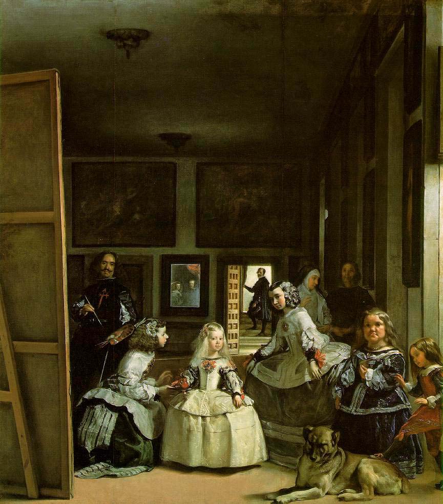
I still remember when we walked in to see the former Velazquez "gallery" for the first time. My friend Liz (the first and best Art Historian I've ever met) laid eyes on Las Meninas, her favorite painting, immediately, and started to cry. It was the first time that the emotional effects of art really became understood to me, and just how powerful it could really be.
My favorite, most exceptional memory from the Prado involved Francisco Goya's Tres de Mayo, 1808, pictured left. For extra credit, Liz and I offered to do 15 minute presentations to our class in front of the painting of our choice. In Spanish. In the Prado. She presented on Velazquez's Las Meninas, and I spoke about Tres de Mayo. Other visitors touring the museum even stood to listen to my presentation. It was such an incredible challenge, speaking about a painting in front of said painting in a foreign language. It was a really proud moment for me.

2. The High Museum of Art, Atlanta, GA

 
The High Museum is the first art museum I'm sure I ever went to, given that its largest art museum in my home city/state. As you can see, even the building is super dynamic...especially with the Calder in the front yard. After the renovations and cooperative exhibitions with the Louvre during the 2000s, it has become a world class art museum. I have seen exhibits for works from the Louvre, Titians from the National Museum in Edinburgh, the Terracotta Warriors from China, Leonardo Da Vinci, Allure of the Automobile, and Salvador Dali.

Whatever the High is doing and whoever they're talking to, they truly have the "in" for exceptional traveling exhibitions. I believe Andy Warhol is there right now!
Of their own collection, I'd say that the contemporary arts are their greatest strength. However, they have amazing marble sculptures, Tiffany glass, Monets, and more than cannot be overlooked! The wet drapery marble sculptures are my favorite (sorry this photo is so dark).

They also have a really impressive array of programming that will have something for every age. I've been for "Wine Night" during the Da Vinci exhibit which was a lot of fun, especially as a Mother-Daughter date night!


3. The Isabella Stewart Gardner Museum, Boston, MA
Okay. So. I've never been to the Gardner Museum. This is my "Art Museum Fantasy" right now. Can you blame me?
A) THAT is what it looks like --->
B) They house Velazquez's Portrait of Pope Innocente X and King Philip IV of Spain, Titian's Rape of Europa (That in itself is worth a trip!), works by Anders Zorn, James McNeill Whistler, and Rembrandt, and basically, they have a phenomenal collection.

Main reason I want to go to the Gardner Museum (besides for the Titian :)) is to see John Singer Sargent's El Jaleo: Danse de Gitanes.

I have now written not one, but two papers that discuss this painting, and I feel a great attachment to is, for all of that research. I think it is a masterful painting, and Mrs. Gardner had its current location specifically made for it to be housed there. Bottom line: It would be a dream to see it, after working with it so much over the past year. It might be for me what Las Meninas was for Liz.

4. Indianapolis Museum of Art, Indianapolis, IN

The IMA is easily one of the most beautiful art museum campuses I have ever been on. In addition to their amazing 4 story museum, there are a host of walking trails, two historic homes/event spaces, luscious gardens, a lake, and a greenhouse to fill your day. It is a beautiful summer retreat, so I highly recommend you go. Right now. And we haven't even discussed the art opportunities yet!

My favorite collection at the IMA is, well...the entire first floor (second of the building). This floor houses the American/European paintings, and folks, I am a "painting person." They also have one of the larger collections of ceramics/furniture than I have personally seen in my art museum tours. My favorite paintings of theirs include Frederic Church's Our Flag (1864), Whistler's Harmony in Pink and Grey: Lady Meux (1881), Camille Pissarro's The House of the Deaf Woman and the Belfry at Eragny, and the two Monets.

To the right is Monet's The Church of San Giorgio Maggiore, Venice, 1908. A spectacular painting. Monet actually uses a great deal of warm pink and gray blue tones in this painting and its IMA sister, Charing Cross Bridge, 1900.

Now, besides all of the paintings, the IMA has a great contemporary art exhibit (there's a Chihuly glass sculpture on display! And this awesome mylar...bubble...ball...sculpture-installation thing that is really fun!), African and Asian art galleries, and a temporary fashion installation right now. Those fashion exhibits are always so neat.  Worth it. Go now.


Yes, I am super biased with this one, but I don't care! Biases aside, the IU Art Museum is an incredible art museum, even when compared outside of univerity settings.
There are 1,400 works on display across the three floors of permanent collection galleries, and around 40,000 works in the museum's collection. They have Picasso, Monet, Stuart Davis, Franz Marc drawings, an original publication of Goya's Los Caprichos, Kandinsky, Carracci engravings...and that's all just from the Western art collection! The African art collection is one of the top 5 in the entire country, and is so diverse and absolutely incredible. There are some wonderful Ancient vases, marble sculptures, and jewelry. The Asian art collection is small but inspiring. There are rotating special exhibitions every fall and spring that have addressed Andy Warhol, Iranian war posters, instruments from the Silk Road, Perle Fine...a distinct variety in just in the two years I've been here.
The picture at right is my friend Kate with Emmi Whitehorse's Rushing Water, part of our Contemporary Native American artist rotation in the first floor gallery. I love, love, love this painting. This could be because I've always identified with warm colors or maybe the fact that it portrays water out in the Southwest, and yet its done in the colors of fire. I love that interplay.
And then of course, one of my favorite parts of the museum which I have discussed before:
The Light Totem.
Light Totem Photo by Matt James.
Admission to the IU Art Museum is always free, and there is a great cafe and gift shop on the second floor for you to browse as well. They also have a student-run blog so you can follow called Art from All Angles. I'm going to be really sad when I am not able to visit this museum every day, but hopefully this post has inspired you to visit and begin an art museum love affair yourself. :)

Sunday, April 1, 2012

Something Sweet

Happy first day of April, everyone!!

Yesterday was my birthday (Whew, missed April Fools by "this much") and every beverage my friends got me was some kind of "cake" or pie flavor. Thanks to you, friends. :)

Cake got me thinking about the whimsical, delicious art of Wayne Thiebaud. In undergrad, I wrote a paper comparing Thiebaud's Around the Cake to Jean-Simone Chardin's La Brioche. To quote from my paper (in describing Around the Cake):

"He seemed in places to literally coat the paint on the canvas as if he were icing a real cake, giving the illusion of thickness and real frosting. The technique intrigues the viewer, tempting them to investigate whether or not the icing texture is real."

And then this morning, I found this wonderful video about a retrospective of Thiebaud's work, where you get to meet the adorable Thiebaud and learn a little bit more of his story. Enjoy!


"If we don't have a sense of humor, we lack a sense of perspective." - Wayne Thiebaud

Friday, March 23, 2012

Art Obsessions

I thought I'd use this opportunity to highlight a few of the (ART) things I am REALLY stoked about right now.

Cave to Canvas.

An online Art Historian/friend of mine runs another incredible Art History blog called Cave to Canvas. I highly recommend you check it out. She produces such a varied collection of art works/artists...there's something for everyone, and I think you'll discover new art interests you never knew you had! Her blog is great exposure to the art world....Go visit!


Franz Marc & German Expressionism.


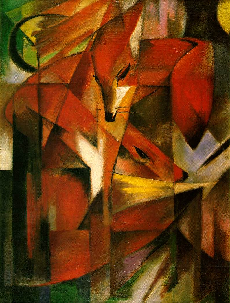
I have the fantastic opportunity to participate in a friend's thesis vocal performance for her Master's by providing a powerpoint of images from the period/artistic movement her performance relates to. It allows me to reiterate my love-love-love for German Expressionist Franz Marc and his colorful, dynamic, segmented animal paintings/drawings. Here at the museum, we have a watercolor sketch of four foxes by him that I fell in love with immediately. These Foxes (1913) at right are not that image, but it gives you the idea. :)

Foxes, 1913, Oil on canvas, 87 x 65 cm, Kunstmuseum, Dusseldorf. Via.


Fine Art in High Fashion.


When googling 'art in fashion,' this was one of the incredible pieces I found. Dior, in their exhibit Inspiration Dior at the Pushkin Museum in Moscow in 2011, amassed an unbelievable fashion collection for display. If you follow the link, you can even view the exhibition itself in 360 degrees like you're there. The piece that blew me away, made known from Wicked-Halo.com was this...Dior's tribute to Japanese print-maker Hokusai's ultra-famous The Great Wave off Kanagawa, 1829-32. The collection looks at other 19th-century art works as fashion inspiration as well, including works from Gauguin, Matisse, Picasso and others.

Monday, March 19, 2012

"Letting it magically happen" - The art of Sylvia Ji

Wow.

I started tonight with the intention of gathering quotes by female artists to share with you all in honor of Women's History Month (March). Instead, I happened upon a new, contemporary artist I had never seen before, and I have to say, I'm pretty enthralled.

Red Quechquemitls, 2010. Via.

This was the first work of Sylvia's that I saw, and truth be told, the elaborate face painting reminded me of a calavera from the Mexican Día de los Muertos, and I assumed (wrongfully) that this was going to be a latin artist. At least I was right in believing this traditional Mexican holiday inspired her.

I still remember learning about el Día de los Muertos (November 2nd) for the first time in the 8th grade from my exceptional, and slightly eccentric, social studies teacher Mrs. Lynch. She was so cool. And el Día is a fantastic, slightly spooky, holiday too. It's like Halloween, in a way, but is specifically for honoring one's deceased ancestors, vs. gorging oneself on as much candy as humanly possible.

Blue Rose, 2008. Via.

Sylvia Ji was born in 1982 and received her BFA in Illustration from the Academy of Art in San Francisco. She's exhibited her work worldwide, presenting in both group and solo shows, her first successful solo show happening in the last year of her undergraduate career.

Belle Epoch, 2005-2006. Via.

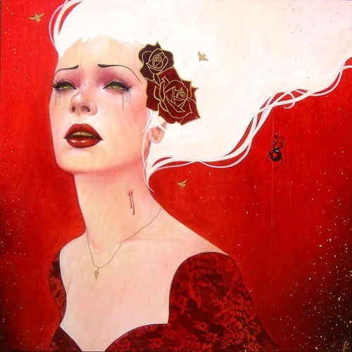
Ji's style and content are both beautiful and edgy, whimsical and haunting, provocative and emotional. The graceful women she depicts express a range of emotion: daring, sadness, longing, a challenge, lust, anger, and almost all evoke a sense of mystery. According to the Joshua Liner Gallery (New York, NY), Ji's women can be symbolic reflections of herself, people she knows, or "nameless faces set in a landscape of fleeing and decaying beauty."

Black Domina, 2008. Via.

She embraces a range of cultures in her works, all the while focusing on women. The Mexican flavor is obvious. She also has some Asian women, what appear to be Native American women, Baroque European, and more French looking women throughout in oeuvre. (Is calling it an oeuvre too art historical of me?)

Lovesick, 2005-2006. Via.

Lovestruck, 2005-2006. Via.

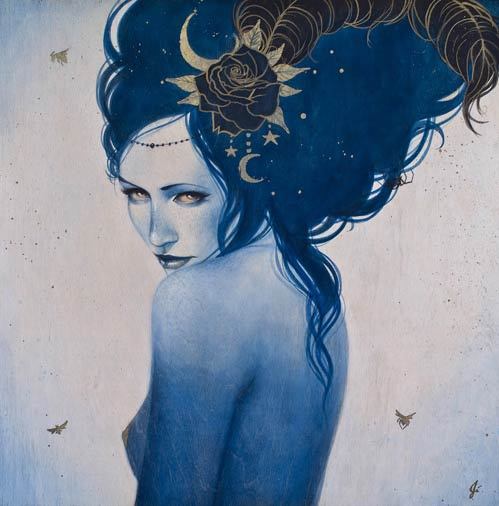
I was personally drawn to these works because of a) the calavera painted faces; b) the intense colors; c) the feminine mystique and mystery, as well as raw emotion of her characters; d) the elaborate costuming. Even on Nyx, seen below, who is for all-intensive purposes wearing nothing, the rose, feather plume, crescent moons, and stars in her unruly, piled-high mane is just exquisite. Lovestruck and Lovesick above remind me a little bit of Alice in Wonderland.

Nyx, 2009. Via.

Calendula, 2011. Via.

This one is probably my favorite. I love the contrast between the yellow-oranges and the green-blues for starters. Next, while her gaze is absolutely haunting and penetrates every nook and cranny of your soul....her gaze penetrates every nook and cranny of you soul. It's a full-frontal conversation between Calendula and the viewer. And obviously not a very good one. Her unyielding, narrowed sky-colored eyes leave you wondering..."what in the heck did I do to offend this chick?" It makes the viewer fathom and imagine a story in their heads...and that is a very powerful thing.

I guess that's just it. For me, her work is Power.